Ecommerce conversion rate optimization: a complete guide for small businesses
Small businesses don’t lose sales because their products are bad. They lose sales because the site fails to optimize the user experience and ecommerce conversion rate optimization, making people hesitate, get confused, or abandon the checkout process. This guide shows you how to improve conversion rates with practical fixes you can apply page by page, so you can earn a higher conversion rate over time with simple tests and a weekly routine focused on usability.
Start with the numbers that matter: ecommerce conversion rate optimization, revenue per visitor, and profit per order
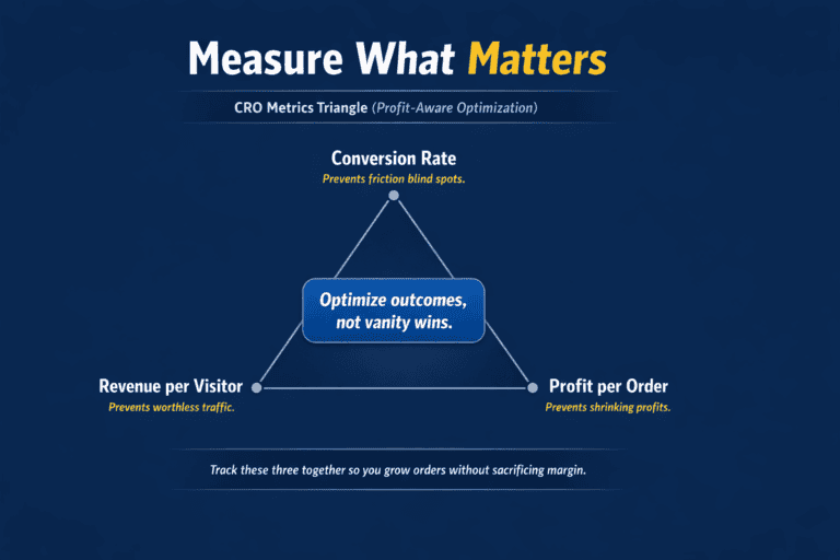
If you only track “conversion rate,” using ecommerce analytics you’ll make the wrong changes. A discount can raise conversions while shrinking profit. A prettier product page can lift clicks and add-to-carts but still fail to improve conversion rates at the point that matters: completed orders. Start with three numbers that tell you the truth about performance: conversion rate, revenue per visitor, and profit per order. Conversion rate shows how many sessions turn into orders, so you can spot friction, usability problems, and broken steps in the checkout process.
Revenue per visitor tells you whether traffic is actually worth anything, so you can compare pages, channels, and campaigns without guessing. Profit per order keeps you honest, because it forces you to include shipping, payment fees, returns, discounts, and cost of goods, not just sales. When you watch these together, you can see the difference between “more orders” and “better business,” and you can prioritize changes that optimize the user experience, protect margin, and drive higher conversion.
Track user behavior without guesswork: Checkout flows, Page speed, CRO tools and conversion goods
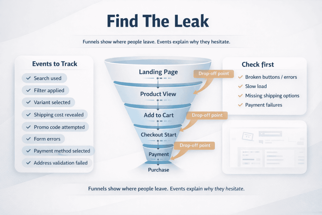
You can’t improve conversions if you don’t know where shoppers drop off during checkout flows. The goal of tracking is simple: see the exact step where intent turns into hesitation, then fix that step first. Start with clean analytics setup so your numbers are trustworthy. Make sure every “success” action is tracked as a conversion (purchase confirmation page), and that common sources of noise are filtered (payment test orders, internal traffic, developer testing) and page speed using CRO tools. If you use multiple domains or subdomains for checkout, confirm cross-domain tracking is working so sessions don’t get split and look like fake drop-offs.
Next, build funnels that match how people actually buy on your site. A basic ecommerce funnel is: landing page → product view → add to cart → checkout start → payment → purchase. Track this funnel by device too, because mobile problems often hide inside “overall” averages. When a step has an unusually large drop, don’t jump straight to redesign. First check for technical causes like broken buttons, slow loading, missing shipping options, or payment errors. A small bug can look like “customers changed their mind” when it’s really “customers couldn’t continue.”
Event tracking fills the gaps between pages. Pages tell you where a shopper went; events tell you what they tried to do. Track the actions that signal intent and friction, such as: search used, filter applied, size/variant selected, shipping cost revealed, promo code attempted, form errors, payment method selected, and address validation failures. These events let you answer practical questions like “Are people abandoning because shipping is expensive, or because they can’t find their size?” and “Do promo codes improve checkout, or do they distract shoppers and increase exits?”
Keep the basics tight, then only add more tracking when it will change a decision. A small business doesn’t need a complex tracking library to do CRO well. What you need is reliable purchase tracking, a clear funnel view, and a short list of events that explain why people stall. Once that foundation is in place, every improvement becomes easier to justify, easier to measure, and harder to argue about.
Learn quick “first impression” checklist you can run today to double your conversion rate
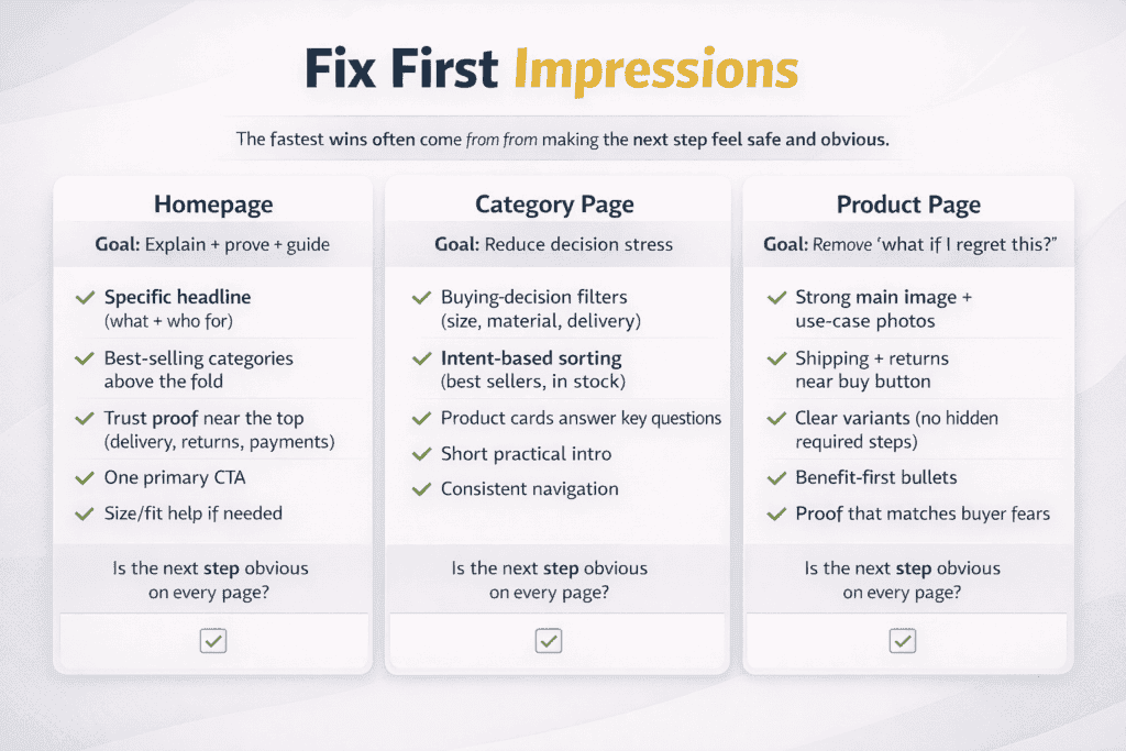
First impressions decide whether a shopper keeps going or bounces. For small businesses, the fastest conversion goals usually come from reducing doubt on the three pages most people see first: the homepage, category pages, and product pages. You are not trying to “look premium.” You are trying to make the next step feel safe and obvious.
Homepage: answer “what is this ecommerce store?” in five seconds
Your homepage should do three jobs quickly: explain what you sell, show who it’s for, and prove you’re legitimate. If a new visitor can’t tell what you offer, they won’t dig around to figure it out.
Focus on these fixes:
-
Make the main headline specific (product type + who it helps), not a vague brand slogan.
-
Put your best-selling categories above the fold so shoppers can self-select fast.
-
Add clear trust proof near the top: delivery promise, returns policy, payment methods, and a short “why buy from us” line.
-
Use one primary call-to-action (Shop best sellers, Shop new arrivals, Shop by category). Too many choices slow people down.
-
If you sell something that needs fit or compatibility, link to a size guide or “find your match” tool right away.
Category pages: help people choose without forcing them to click every product to improve conversion rate
Category pages convert when they reduce decision stress. Shoppers want to narrow down options, compare quickly, and feel confident they’re in the right place.
Improve categories with:
-
Useful filters that match buying decisions (size, color, compatibility, material, price, delivery speed), not every attribute you have.
-
Sort options that reflect intent: best sellers, price, newest, rating, and “in stock.”
-
Product cards that answer common questions without extra clicks: price, key feature, star rating/review count, delivery estimate, and stock status.
-
A short category intro that sets expectations (who it’s for, how to pick, what’s different here). Keep it brief and practical.
-
Clean URLs and consistent navigation so shoppers don’t get lost between filters and subcategories.
Product pages: remove the “what if I regret this?” feeling and focus on conversion rates
Most doubt lives on the product page. Your job is to remove uncertainty about value, fit, risk, and delivery.
Start with the essentials:
-
A clear title that matches what people search for (brand + model + key attribute).
-
One strong main image, then supporting images that show scale, detail, and use-case.
-
Price clarity: show discounts, bundle savings, and what’s included.
-
Shipping and returns near the buy button, not hidden in the footer.
-
A visible stock message that feels honest (in stock, low stock, backorder date).
Then reduce friction at decision points:
-
Make variants simple. If size/color selection is required, show it clearly and avoid defaulting to “Select” with tiny text.
-
Use benefit-first bullet points above the long description: what it does, who it’s for, why it’s worth it, what problem it solves.
-
Add proof that matches the buyer’s fear: reviews with specific outcomes, photos from customers, guarantees, and clear support contact.
-
Handle objections directly: compatibility notes, care instructions, sizing advice, warranty, and what to do if it doesn’t fit.
A quick “first impression” checklist you can run today
-
Can a new visitor understand what you sell in five seconds on the homepage?
-
Can a shopper narrow choices on category pages without extra clicking?
-
Can a buyer answer: “Will this work for me, arrive on time, and be easy to return?”
-
Is the next step obvious on every page (shop, filter, add to cart, checkout)?
When you fix first impressions, you reduce bounce rate, increase product views, and improve add-to-cart rates without spending more on ads. These are high-leverage changes because they improve every traffic source at the same time.
Make checkout easier: remove friction, shorten forms, and offer the right payment options to improve conversion goals
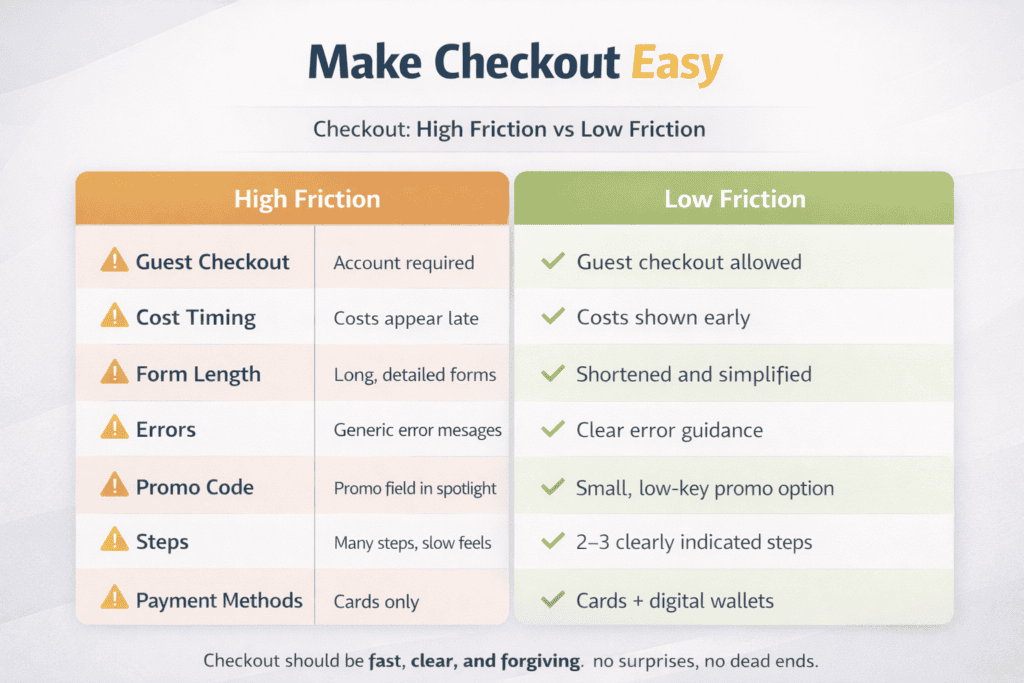
Checkout is where “I want it” turns into “not worth the hassle.” Small businesses often lose sales here for simple reasons: too many steps, too many fields, surprise costs, or the buyer can’t pay the way they prefer. The goal is not to make checkout fancy. The goal is to make it fast, clear, and forgiving.
Remove friction before you redesign anything to improve conversion rate
Start by fixing the blockers that stop people from paying:
-
Allow guest checkout. Forcing account creation adds hesitation and password frustration.
-
Show full costs early. If shipping, taxes, or fees appear late, shoppers feel tricked and abandon.
-
Keep the cart visible. People want to confirm items, quantities, and totals without losing progress.
-
Reduce “dead ends.” Clear error messages, no page reload loops, and a visible “back” option that doesn’t wipe fields.
-
Make promo codes low-distraction. If coupons are rare, don’t spotlight the field and send people hunting for codes.
Shorten forms by removing fields, not by squeezing the layout
Most checkout forms ask for information you don’t need. Every extra field increases drop-off, especially on mobile. Strip it down to what’s required to deliver the order and prevent fraud.
Practical form simplifications:
-
Combine first and last name into one field if your shipping carrier allows it.
-
Hide “company,” “address line 2,” and “delivery instructions” unless someone chooses to use them.
-
Use postcode lookup or address autocomplete where possible to reduce typing errors.
-
Default shipping address = billing address, with a simple toggle if different.
-
Use the right keyboard types on mobile (numeric keypad for phone/postcode where relevant).
-
Validate in real time. Don’t wait until the end to tell someone their postcode is invalid.
If you need extra details for certain products (engraving text, custom sizing, delivery date), collect them in the product flow or cart step, not as surprise checkout fields.
Reduce steps and keep progress obvious
A long checkout can work if it feels controlled. A short checkout is better if it feels safe.
Good step design includes:
-
One-page checkout or a clear 2–3 step flow (details → delivery → payment).
-
A progress indicator so shoppers know how close they are.
-
Persistent support options (chat, WhatsApp, email) for last-minute questions.
-
Clear delivery promise text near the shipping selection, not buried later.
To improve conversion rate offer the payment options your customers actually use
Payment choice is not a nice-to-have. If someone reaches checkout and can’t pay the way they prefer, your conversion rate drops instantly.
Cover the basics first:
-
Cards (Visa, Mastercard, Amex where relevant)
-
Digital wallets (Apple Pay / Google Pay) because they reduce typing and increase mobile completion
-
Local methods where your buyers are (this matters a lot if you sell cross-border)
Then decide on “buy now, pay later” and bank transfers based on your average order value, return rate, and fraud risk. If you add payment methods, keep the display clean: show the top options first, and tuck the rest behind “more ways to pay.”
Make checkout feel safe and predictable
People don’t abandon only because it’s slow. They abandon because something feels risky.
Add reassurance in the moments that matter:
-
Security cues near payment (not a wall of badges, just enough to reassure)
-
Clear returns summary: “X days returns” and “how refunds work”
-
Delivery expectations: dispatch time, tracking, and cut-off times if you have them
-
Contact details that look real: a support email, live chat, and an address or company info page
What to test after the basics are fixed
Once you remove obvious friction, test changes that improve completion rate without hurting profit:
-
Guest checkout vs. account-first
-
One-page checkout vs. multi-step
-
Showing delivery costs earlier vs. later
-
Defaulting to the most common shipping option
-
Moving promo code entry to a smaller link
The best checkout is boring in a good way. Fewer fields, fewer surprises, and the right payment options make it easier for shoppers to finish what they already decided to buy.
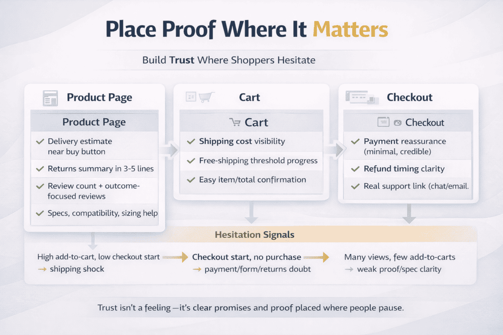
Build trust where shoppers hesitate: shipping, returns, reviews, and on-page proof
Trust is what turns “I like it” into “I’ll pay now.” Most shoppers don’t hesitate because they doubt the product. They hesitate because they doubt the outcome: Will it arrive on time? What if it doesn’t fit? Is this store real? Your job is to remove that doubt at the exact moment it shows up on the product page, in the cart, and at checkout.
Shipping: make delivery feel predictable, not vague
Shipping is one of the biggest causes of abandonment because it changes the total cost and the timeline. If shoppers have to guess, they assume the worst.
Build shipping trust with:
-
A clear delivery estimate near the buy button (not hidden in a policy page)
-
A simple line that explains dispatch time (for example: “Ships in 1–2 business days”)
-
Shipping cost clarity before checkout, ideally in cart
-
A short note about tracking and carriers (people want to know they won’t be left in the dark)
-
Honest messaging for exceptions (remote areas, peak season delays, pre-orders)
If you offer free shipping, don’t bury the threshold. Show it where it helps decisions, and add a cart progress message so shoppers know how close they are.
Returns: reduce risk with clear rules and simple language
Returns are not a legal page. They are a sales tool. Shoppers look for returns info when they’re unsure about fit, quality, or whether the item matches the photos.
What high-converting returns info does:
-
Summarizes the policy in 3–5 lines on the product page and checkout
-
States the time window in plain language
-
Explains the condition requirements (unused, tags on, original packaging) without sounding hostile
-
Clarifies who pays return shipping and how refunds are handled (store credit vs original payment)
-
Sets expectations on timing (how long refunds usually take)
If your policy is strict, you can still build trust by being direct. Shoppers hate surprises more than they hate rules.
Reviews: make them specific, not just high-rated
A five-star average helps, but “why” sells. The best reviews answer the questions your buyer is silently asking: Does it fit? Is it durable? Is it easy to use? Does it look like the photos?
Improve review impact by:
-
Showing review count and average rating near the title
-
Featuring reviews that mention outcomes (fit, comfort, performance, delivery speed)
-
Adding photo reviews when possible (they reduce “is this real?” doubt)
-
Using review filters (size, use case, model, verified purchase)
-
Highlighting common themes with a short “what customers mention” summary
If you have a small number of reviews, don’t hide them. One detailed review can do more than 50 generic ones.
On-page proof: show the store is real and reliable
Proof is anything that reduces the fear of being scammed or disappointed. Small businesses can win here because they can be more human and more direct than big marketplaces.
Strong on-page proof includes:
-
Clear business identity: company name, contact email, support hours, and a real address or service area
-
Visible payment icons and security basics near checkout
-
Trust signals that match your niche (warranty, authenticity guarantee, safety certification, materials info)
-
Social proof beyond reviews: customer photos, UGC, press mentions, partnerships, case studies
-
Simple “why us” bullets that are verifiable (fast dispatch, easy returns, local support)
Avoid overloading pages with badges. One or two strong proof points, placed near the decision point, beat a cluttered footer full of icons.
Fix trust gaps in the exact spots where people pause
You can usually tell where trust is weak by where people stall:
-
High add-to-cart but low checkout start often means shipping cost shock or doubts about delivery.
-
Checkout started but no purchase often means payment trust issues, form friction, or unclear returns.
-
Lots of product views but few add-to-carts often means weak proof (few reviews, unclear specs, poor photos).
Put trust information where it answers the question in the moment:
-
Product page: delivery estimate, returns summary, key proof, detailed specs
-
Cart: total cost visibility, shipping options, free-shipping threshold progress
-
Checkout: payment reassurance, refund timing, support contact link
Trust is not a “brand feeling.” It’s a set of clear promises, backed by proof, placed where hesitation happens. When you tighten shipping clarity, returns confidence, and review quality, you remove the most common reasons shoppers abandon at the finish line.
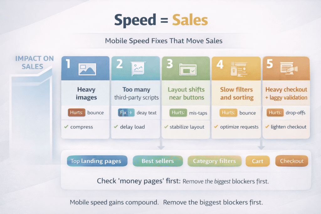
Improve speed on mobile: performance checks that directly impact sales
Mobile speed is not a technical “nice to have.” It is a sales issue. On a phone, every extra second increases frustration, mis-taps, and drop-offs. If your pages feel heavy, shoppers don’t politely wait. They bounce, or they abandon during checkout. The good news is you don’t need a full rebuild to get meaningful gains. You need a short list of checks that remove the biggest slowdowns first.
Start with the pages that make money
Don’t measure speed on random pages. Check the pages that directly affect revenue:
-
Top landing pages from ads and search
-
Best-selling product pages
-
Category pages with filters
-
Cart and checkout steps
If only one of these is slow, it can drag your entire conversion rate down, even if the rest of the site feels fine.
Run a simple mobile performance audit
Use a repeatable checklist so you can spot problems quickly and confirm improvements after changes.
Key checks that usually impact sales:
-
Time to first usable screen: does the page show meaningful content quickly, or is it blank/spinning?
-
Image weight: are product and hero images compressed and sized for mobile, or are huge desktop images being forced into a small screen?
-
Script bloat: are you loading too many apps, tracking tags, chat widgets, popups, and sliders on every page?
-
Layout shifts: does the page jump around while loading (especially near the add-to-cart button)?
-
Checkout stability: does checkout load fast and stay responsive when entering address and payment details?
These issues are visible to shoppers even if your site “passes” a generic test.
Fix the biggest speed killers first
Most small business sites are slow for the same reasons. Prioritize these in order:
-
Heavy images and too many images
Compress images, serve modern formats where possible, and make sure you’re not loading massive originals. On product pages, keep the gallery useful, but avoid loading every image at full size on first view. -
Too many third-party scripts
Every marketing tag, review widget, pop-up tool, and heatmap script adds load and can block interactivity. Remove what you don’t actively use, and delay anything that doesn’t need to load before the shopper can browse and tap “Add to cart.” -
Overdesigned mobile layouts
Large sliders, animations, and complex page builders often slow mobile down. If a page looks “cool” but feels sluggish, simplify. Mobile shoppers value speed and clarity more than motion. -
Slow category filters and sorting
Filters are often built in a way that reloads the whole page or fires multiple requests. Make sure filter changes are fast, don’t break back-button behavior, and don’t generate laggy page jumps. -
Checkout friction from loading and validation
If address entry lags, fields reload, or payment takes too long to appear, you will lose buyers at the highest-intent moment. Checkout should be the lightest part of your site, not the heaviest.
Make sure your mobile page is easy to use while it loads
Speed is partly about perception. Even if a page isn’t perfect, you can reduce abandonment by making it feel responsive:
-
Keep the main product info and buy button high on the page
-
Avoid banners that push key info down the screen
-
Limit popups on mobile (especially on first visit)
-
Ensure buttons are large enough and not too close together
-
Prevent layout shifts so shoppers don’t mis-tap
If shoppers mis-tap or lose their place, they often quit instead of trying again.
Tie speed work to sales outcomes, not just scores
A faster score is nice, but your goal is more completed purchases. After each change, compare:
-
Bounce rate on mobile landing pages
-
Add-to-cart rate on mobile product pages
-
Checkout completion rate on mobile
-
Revenue per visitor on mobile
If speed improves but sales don’t, look for the next bottleneck: unclear shipping, weak trust proof, or checkout complexity.
A practical weekly speed routine for small teams
-
Review the top 10 mobile landing pages and top 10 product pages.
-
Check for new heavy images, new apps, or new scripts added since last week.
-
Test checkout on a real phone from product page to payment.
-
Fix one high-impact issue, then re-check the same pages.
Mobile speed improvements compound. Every second you remove makes browsing feel easier, checkout feel safer, and buying feel more effortless which is exactly what conversion rate optimization is supposed to do.
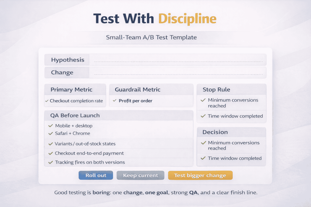
Run simple tests that small teams can manage: A/B testing, QA, and when to stop
Small businesses don’t need complex experimentation programs to get CRO wins. What you need is a simple testing habit your team can run without breaking the site, wasting weeks, or arguing about opinions. Good testing is boring on purpose: one clear change, one clear goal, clean QA, and a stop rule so you don’t keep “testing” forever.
Start with changes that are easy to measure
Pick tests that target a specific hesitation point and connect to a clear metric. Examples:
-
Product page: change the buy button area (delivery promise + returns summary + trust proof) to reduce doubt
-
Cart: show shipping estimate earlier to reduce surprise costs
-
Checkout: guest checkout vs account-first to reduce abandonment
-
Category pages: improve filters and product card info to increase product clicks and add-to-carts
Avoid tests that change too many things at once (new design + new copy + new layout). If results move, you won’t know why.
Choose one primary metric per test
If you track five “success” metrics, you can talk yourself into any conclusion. For each test, pick one main metric that matches the page:
-
Homepage tests: click-through to category or product pages
-
Category tests: product page views and add-to-cart rate
-
Product page tests: add-to-cart rate (and downstream purchase rate if traffic allows)
-
Checkout tests: checkout completion rate
Keep a secondary “guardrail” metric so you don’t win the test but lose profit, such as profit per order or refund rate.
Keep A/B testing simple
A/B testing means you show two versions at the same time to similar visitors and compare outcomes. The basics that matter:
-
Test one meaningful change at a time
-
Split traffic evenly
-
Run the test long enough to cover normal day-to-day variation (weekdays vs weekends)
-
Don’t change other major site elements mid-test (promos, shipping rules, pricing)
If your traffic is low, you can still test. Just use bigger changes and focus on high-traffic pages like best sellers and checkout.
QA is what makes your results trustworthy
Most “failed tests” fail because something broke. QA is not optional. Before you launch:
-
Check the experience on mobile and desktop
-
Test common browsers (at least Safari + Chrome)
-
Verify key variants work (sizes, colors, out-of-stock states)
-
Add-to-cart, cart update, and coupon entry all function normally
-
Checkout works end-to-end with at least one real payment method (and one saved test method)
-
Confirm tracking is firing on both versions (purchase, add-to-cart, checkout start)
During the test, spot-check daily. If one version is broken, stop immediately and fix it. Otherwise you’ll “learn” the wrong lesson.
Decide when to stop before you start
Small teams waste time when they run tests with no finish line. Set a stop rule up front:
-
Stop when you hit a minimum number of purchases or add-to-carts needed to make the result meaningful
-
Stop after a set time window that covers at least one full buying cycle (often 1–2 weeks for many small stores)
-
Stop early only for clear harm (conversion drops sharply, errors increase, complaints rise)
Also decide what “success” means. If the lift is tiny, it may not be worth rolling out if it adds complexity or hurts readability.
What to do when results are unclear
Unclear results are still useful if you treat them correctly:
-
Check if the test was underpowered (not enough conversions)
-
Look at device splits (mobile can behave differently from desktop)
-
Confirm nothing changed externally (big promotion, stockouts, shipping delays)
-
Review heatmaps/session recordings only to explain “why,” not to declare a winner
If you can’t get a clean answer, keep the current version, write down what you learned, and test a bigger change next time.
Make testing a weekly habit, not a “big project”
A simple CRO routine for small teams:
-
Week 1: identify the biggest drop-off step and propose one change
-
Week 2: launch the test and QA daily
-
Week 3: decide, roll out the winner, document the result, queue the next test
Done well, A/B testing is not about chasing perfect design. It’s about removing one piece of friction at a time, with enough discipline that you trust your own data.
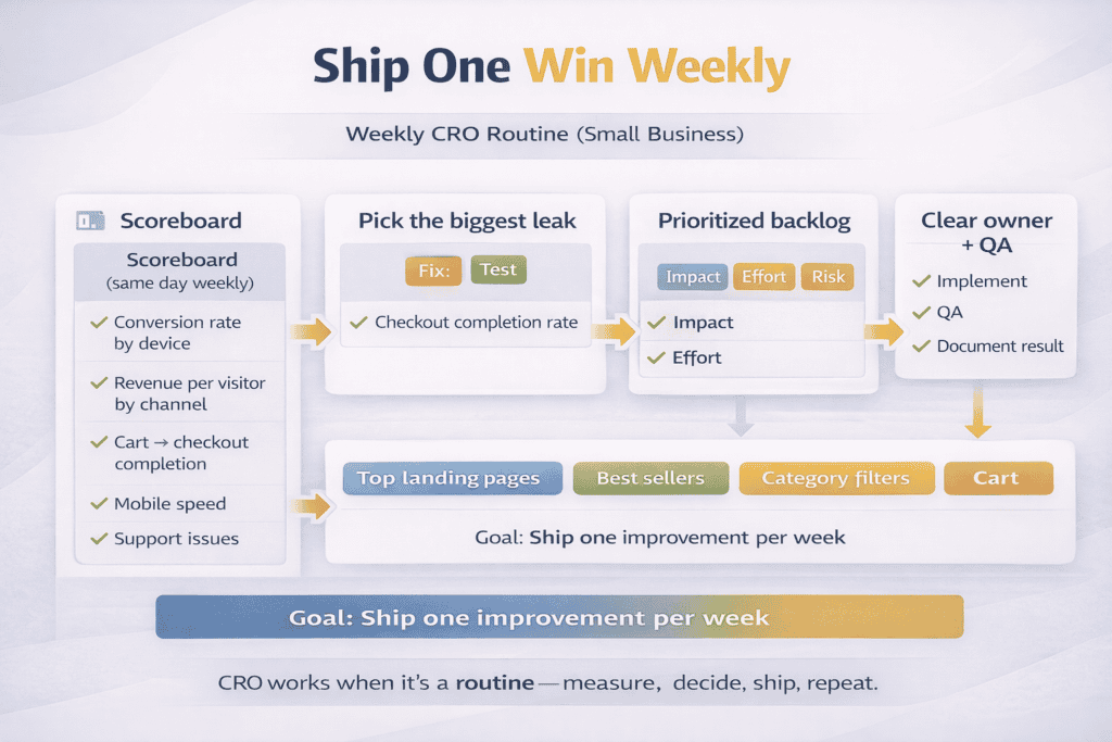
Create a repeatable CRO routine: weekly checks, a prioritized backlog, and clear ownership
CRO only works long-term when it becomes routine, not a one-time project. Small businesses win by running the same checks every week, keeping a short backlog of fixes, and assigning clear ownership so improvements actually ship. This is how you avoid the common pattern of “we found problems” but nothing changes.
Weekly checks: a simple scoreboard you review the same day each week
Pick one day and review the same metrics in the same order. The goal is to spot leaks early and choose one action for the week.
A practical weekly CRO check:
-
Conversion rate by device (mobile vs desktop)
-
Revenue per visitor by channel (paid, organic, email, social)
-
Cart and checkout completion rate
-
Top product pages: add-to-cart rate and product page exits
-
Site speed on mobile for top landing pages and checkout
-
Customer support signals: “where is my order,” returns questions, payment issues
Don’t turn this into a report. The output should be a decision: fix, test, or investigate.
A prioritized backlog: one list, ranked by impact and effort
Most teams lose momentum because CRO tasks sit in emails, chat threads, and “someone should” conversations. Keep one backlog where every idea becomes a trackable item.
Rank backlog items using a simple rule:
-
Impact: how much revenue or conversion it could move
-
Effort: how long it will take and who is needed
-
Risk: chance of breaking checkout or harming trust
Then work the list top to bottom. High-impact, low-effort items should dominate early:
-
Clarify shipping and returns on product pages
-
Fix broken buttons, slow pages, or layout issues on mobile
-
Reduce checkout fields and remove forced account creation
-
Improve product images and variant selection clarity
-
Add reviews and proof near the buy button
Avoid stacking the backlog with “redesign the site.” Big projects delay wins and increase risk.
Clear ownership: one person drives, others support
CRO fails when everyone “owns” it, because no one owns it. Assign a CRO lead who is responsible for weekly review and moving one task from backlog to live. That person doesn’t have to do all the work, but they must own the process.
Define roles clearly:
-
CRO lead: picks weekly priority, writes the test plan, keeps the backlog clean, reports outcomes
-
Developer or platform owner: implements changes, ensures site stability, handles performance fixes
-
Designer or content owner: updates layouts, images, copy, trust elements
-
Support or ops: feeds real customer objections (shipping, refunds, sizing, payment confusion)
-
Marketing: shares campaign timing so tests aren’t ruined by sudden promos and traffic spikes
When ownership is clear, you ship faster and argue less.
A lightweight workflow that keeps things moving
Use a simple weekly cadence:
-
Review metrics and support feedback (30 minutes)
-
Pick one priority task or test for the week (10 minutes)
-
Define success metric and guardrail metric (10 minutes)
-
Implement and QA (time varies)
-
Record the result and update the backlog (15 minutes)
Document each change in plain language: what you changed, why, what happened, what you’ll do next. Over time, this becomes your internal playbook.
Don’t let CRO die during busy weeks
Busy weeks are when CRO matters most because small issues get expensive fast. If you can’t run a test, still run the routine:
-
Do the weekly check
-
Fix one obvious leak (speed, broken checkout step, shipping clarity)
-
Update the backlog and assign the next task
Consistency beats intensity. A repeatable CRO routine gives you steady gains, fewer surprises, and a site that improves every month without needing a full redesign.