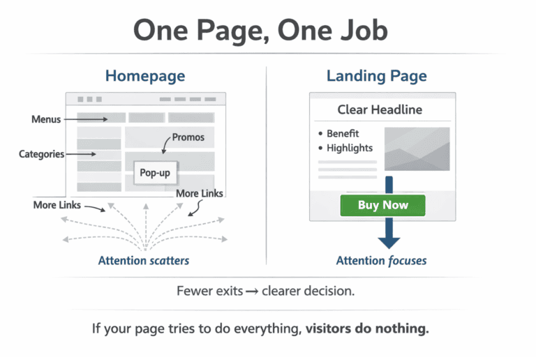
Most online stores send paid traffic to their homepage. Then they wonder why nobody buys. The homepage tries to do too many things at once it shows off the brand, lists categories, promotes sales, and greets new visitors. That’s not a selling environment. It’s a distraction.
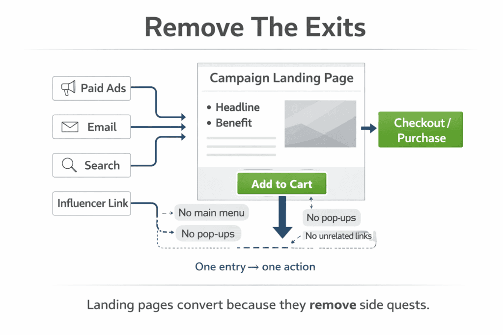
A landing page is different. It has one job: to take someone who clicked an ad, an email link, or a search result and move them toward a single action. No sidebar menus. No pop-ups asking them to subscribe. Just a clear path from interest to purchase.
This guide explains what ecommerce landing pages actually are, how they differ from other pages on your site, and what it takes to build one that converts.
What Makes an Ecommerce Landing Page Different from a Product Page
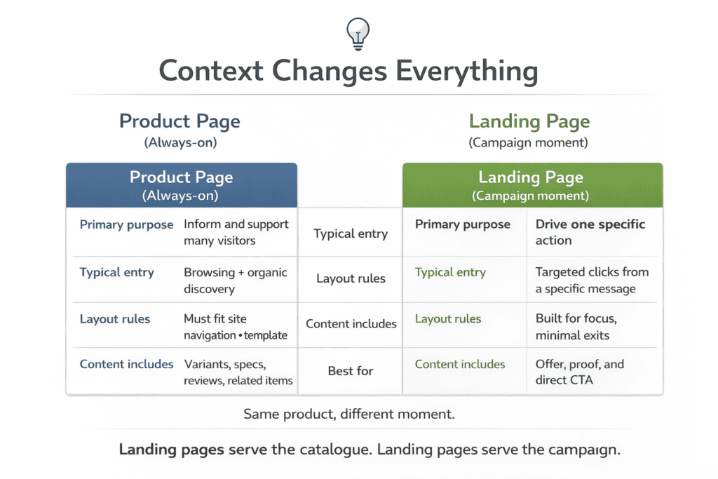
A product page is part of your store’s permanent architecture. It lives in your catalogue, gets visited by browsing shoppers, and needs to serve many types of visitors at once first-timers, repeat buyers, and people who are just looking. It has to fit your navigation, match your brand template, and handle reviews, variants, and inventory information.
A landing page is built for a specific moment. Say you’re running a Facebook ad promoting a summer sale on running shoes. The ad speaks to runners who want a deal. The landing page picks up exactly where that ad left off it mirrors the language, shows only the relevant products, and makes it easy to act immediately. There’s no other destination on the page.
The key difference is context. Product pages work well for organic search traffic and returning shoppers who already know what they want. Landing pages work best when you control the entry point paid ads, email campaigns, influencer links, or social promotions.
When someone arrives from a targeted source expecting a specific offer, a generic product page breaks the connection. A dedicated landing page keeps it intact.
The Anatomy of a High-Converting Ecommerce Landing Page
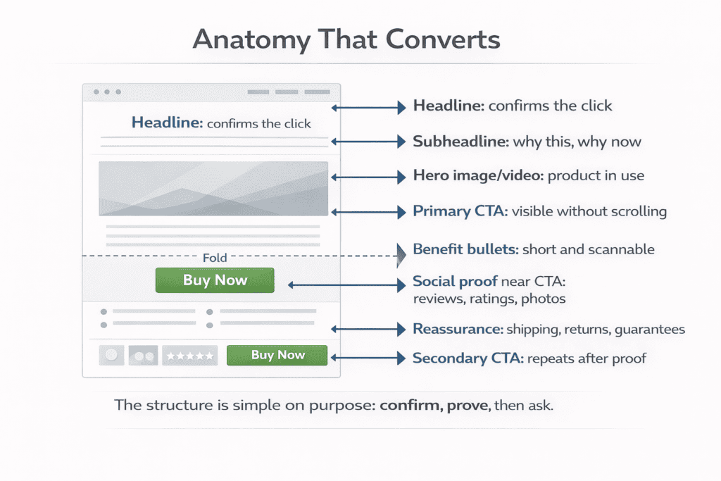
Every effective ecommerce landing page shares a common structure, even if the design varies. Understanding what each element does helps you build pages that work consistently, not just occasionally.
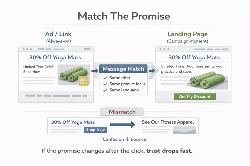
The headline is the first thing a visitor reads. It needs to confirm they’re in the right place within two seconds. If your ad promised 30% off yoga mats, your headline should reflect that directly. A vague or clever headline makes people second-guess whether they clicked the right link.
Below the headline, a short subheadline adds context. It answers the natural follow-up question — why this product, why now, why from you. Keep it to one or two sentences.
The hero image or video does the heavy lifting visually. For physical products, show the item in use rather than on a white background. A protein powder looks unremarkable in a canister. It looks appealing next to a post-workout smoothie.
The call-to-action button needs to be visible without scrolling. Use specific language “Get My Discount” or “Add to Bag” outperform “Click Here” every time. Place it again lower on the page for visitors who need more information before deciding.
Social proof closes the gap between interest and trust. Reviews, star ratings, customer photos, and press mentions all serve this role. Place them close to the call-to-action, not buried at the bottom of the page.
How to Write Copy That Pushes Visitors Toward the Buy Button
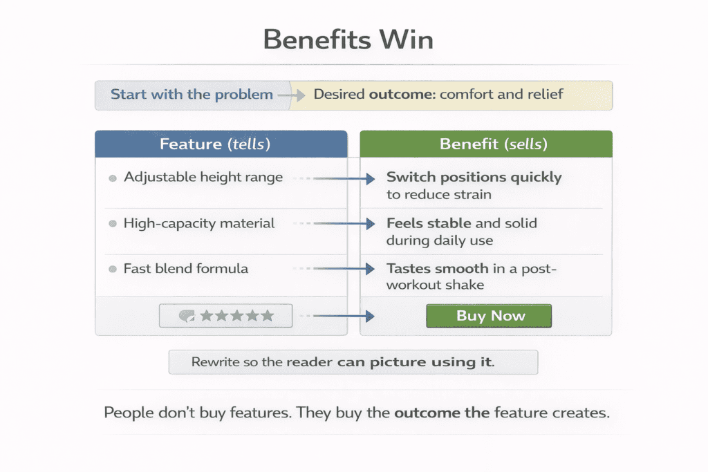
Good landing page copy starts with the reader’s problem, not the product’s features. Someone buying a standing desk isn’t thinking about build materials and weight capacity they’re thinking about back pain after eight hours at a desk. Lead with that.
Features tell. Benefits sell. “Adjustable height range of 60–120cm” is a feature. “Moves from sitting to standing in under ten seconds” is a benefit. The second version helps a reader picture themselves using the product.
Keep sentences short where it matters most headlines, subheadings, and button text. Use longer sentences to explain or reassure. Vary the rhythm so the page doesn’t feel like a bulleted sales brochure.
Address hesitation directly. If price is likely to cause doubt, explain value. If shipping time is a concern for a time-sensitive purchase, state your delivery window clearly. If returns are complicated, simplify them and say so on the page.
Urgency works when it’s real. A genuine countdown to end-of-sale or a low-stock warning based on actual inventory gives people a reason to act now. Fake urgency timers that reset, perpetually “limited” offers damages trust once shoppers notice it.
Design Principles That Reduce Friction and Boost Conversions
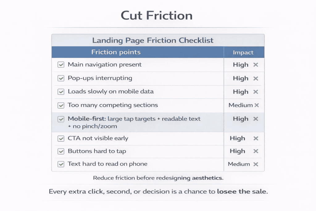
Friction is anything that slows a visitor down or gives them a reason to leave. It shows up in cluttered layouts, slow load times, confusing navigation, and forms that ask for too much information. Each extra click or decision point costs you conversions.
Remove the main navigation menu. This sounds counterintuitive, but it matters. A full site menu gives visitors twelve ways to leave your page before buying. Landing pages convert better when the only obvious path forward is the one you’ve designed.
Page speed is non-negotiable. Research consistently shows that pages taking longer than three seconds to load lose a significant portion of mobile visitors before they’ve seen a single word. Compress images, avoid heavy scripts, and test your page on a 4G connection, not just your office Wi-Fi.
Use whitespace deliberately. Cramming information together doesn’t communicate value it communicates desperation. Give key elements room to breathe. Your headline, hero image, and call-to-action should each feel like the most important thing on the screen at any given moment.
Design for mobile first. More than half of ecommerce traffic comes from phones. Buttons need to be large enough to tap without zooming, text needs to be readable without horizontal scrolling, and checkout should never require a visitor to pinch and zoom to find the payment fields.
How to Match Your Landing Page to Your Ad Traffic
Message match is one of the most overlooked factors in landing page performance. When the language in your ad doesn’t match the language on your page, visitors feel a jolt of disorientation. That feeling makes them less likely to trust you and more likely to go back and look elsewhere.
If your Google ad headline reads “Handmade Leather Wallets Free UK Delivery,” your landing page headline should echo that. Not word for word, but close enough that the visitor immediately thinks “yes, this is what I was looking for.”
Different traffic sources carry different intent. Someone clicking a Google Shopping ad has high purchase intent they searched for a product and clicked through to buy. Someone coming from a Facebook ad was browsing their feed and got interrupted by your creative. These two visitors need different approaches on the same landing page, or ideally, separate pages altogether.
Seasonal campaigns need their own pages. Don’t send Black Friday traffic to a standard product page with a discount code buried in the description. Build a page that leads with the event, makes the saving obvious from the first glance, and creates a sense of occasion.
The closer the alignment between your ad creative, your audience’s expectation, and your landing page content, the better your conversion rate will be. It’s that straightforward.
How to Test and Optimise Your Landing Pages for Better Results
A landing page is never finished. The first version you publish is a starting point, not a final answer. The stores that consistently improve their conversion rates treat every page as an ongoing experiment.
A/B testing means showing two versions of a page to different portions of your traffic and measuring which one converts better. Start with the elements that have the biggest impact headline, hero image, and call-to-action text. Don’t test button colour before you’ve tested whether your headline is actually working.
Run one test at a time. If you change the headline and the image simultaneously and your conversion rate improves, you won’t know which change caused it. Isolate variables so your data means something.
Wait for statistical significance before declaring a winner. A hundred visitors is not enough to make a reliable decision. Depending on your traffic volume, a meaningful test might take two weeks or more. Tools like Google Optimize, VWO, or Unbounce handle the statistical side automatically.
Heatmaps tell you things conversion data doesn’t. If visitors are clicking on an image that isn’t a link, they want more information about the product shown. If they’re not scrolling past the fold, your above-the-fold content might already be enough or it might be failing to create curiosity.
The goal isn’t a perfect landing page. It’s a progressively better one. Small, consistent gains in conversion rate compound over time into a meaningful difference in revenue without spending more on traffic.
Getting It Right From the Start
Landing pages work because they remove everything that gets in the way of a decision. No distractions. No competing messages. Just a visitor, a product, and a clear reason to buy.
Building one well takes more thought than copying a template. You need to understand who’s arriving, what they already believe, and what they need to feel confident enough to hand over their money. Get those three things right and the design and copy will follow.
Start with a single campaign. Build a dedicated page, connect it to your ad traffic, and measure the difference against your current setup. The results will tell you everything you need to know about whether to invest further.